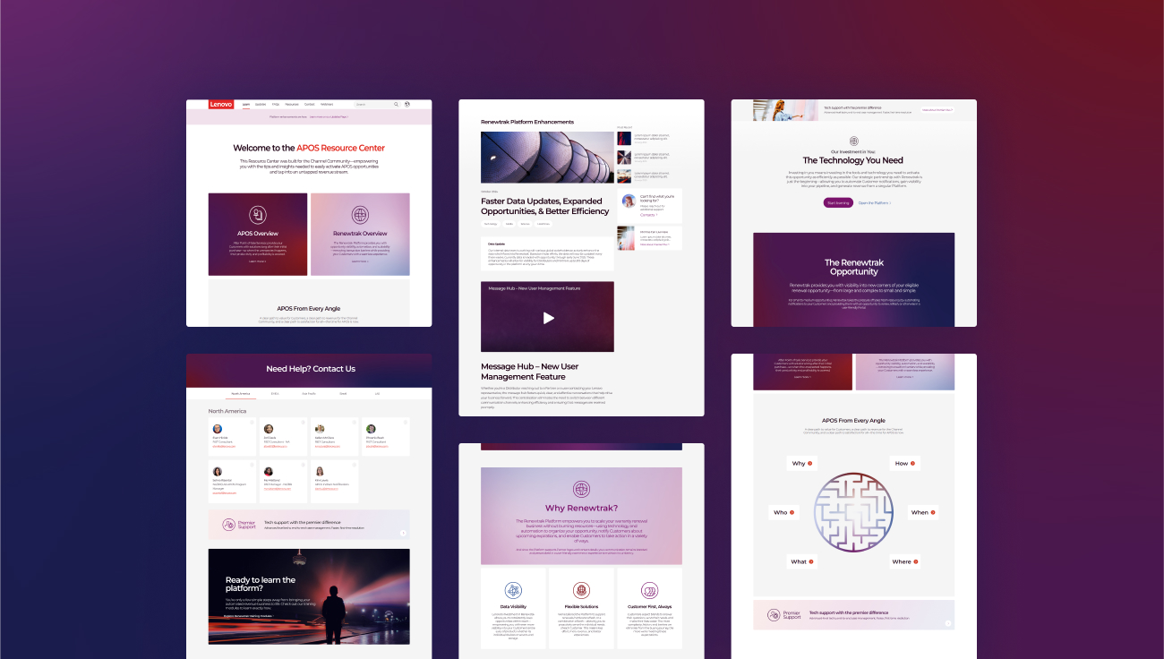
Elevating your Sales Toolkit for Clarity and Cohesion
Sales & Marketing teams are always at crunch-time but especially at this moment where resources are low and expectations for better business outcomes remains high. Whether you are looking to refresh your current assets or expanding to more verticals, the effort to refresh your aging sales collateral and overall toolkit can be frustrating.
Refreshing your sales toolkits does not have to result in a big budget-ask or overload the marketing team with new requests. There are three simple ways to expand your toolkits for sales and still uphold a high degree of visual clarity and fidelity.
Develop a viable shortlist of items needed for an effective Sales Toolkit
Budgets are challenged at every organization but focusing the investment on the most critical components can help lower the stress.
Start with the idea that templatization is key and pillar content can be versioned into smaller content types later.
For example, starting with a master Powerpoint deck as an initial investment can then be versioned into one-pagers, case studies, battle cards and more. This process enables your marketing spend to go further and enables a balanced division of labor between your internal team and a professional services partner.

Polish up your current visual identity without funding a full rebrand
Whether you tap your internal team or a professional services firm like MOD, there should always be a ‘minimum viable product’ approach to polishing a visual identity. The core focus should be refreshing Voice & Tone and Color palette.
Ensuring a clear voice & tone across the toolkit will enable greater cohesion and provide differentiation from the existing toolkit assets. In addition, you should ensure that all communications adopt the latest version of the visual identity so as to avoid further fragmentation of the brand across new and future assets.
If you have time and budget, expanding into custom iconography can add new life to an older visual identity. Custom iconography can come at a higher price but will also allow you to have more ways to liven up existing assets.

Tighten up the Messaging and ensure the story and overall value is clear for each vertical
Ask why and then ask why again. It’s critical to ensure the “Why” is answered in the message and not just a lot of detailed copy about the product or service itself.
If your current messaging is lacking that clarity by vertical, it is worth polishing the messaging with a professional services firm like MOD or host your own internal workshop with representatives from sales, product & marketing to ensure the message is clear and concise.
As it pertains to visual identity, you can also create vertical-specific icons or color palette choices that help create uniqueness by vertical without sacrificing cohesion of the brand.
As you start to develop more cohesive assets, it will become easier to leverage the templates and expand the volume of pieces in the toolkit. Oftentimes, this type of templatized work is easier for in-house production teams to scale up internally. We recommend also establishing the visual identity guide as a living document that can be shared internally as well as with vendors.
In addition, you can negotiate with your vendors to set a rate card so you can have a sustainable pricing model for net new assets and templatized versions of assets based on the established visual identity.

 Back
Back  Strategy Team


