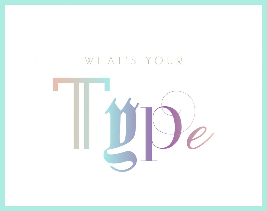
What’s Your Type?
By Bianca Krause / Design
Asking me to pick my favorite font would be like asking a parent which kid they love more. There are certainly fonts I prefer more than others but I would never be able to choose just one to save from a burning building. In more or less words: I LOVE fonts. Typography is what got me interested in design initially and something that I’ve been really passionate about throughout my career. There are hundreds of thousands of fonts available and every single one of them tells an individual story. Whenever I am working on stylizing a brand, I always enjoy finding the most fitting font to visually express the message they’re trying to convey. Inversely, I get to do funky stuff, like assign a font to each member of the MOD team based on their personality. Enjoy The MOD Studio – Typographied.
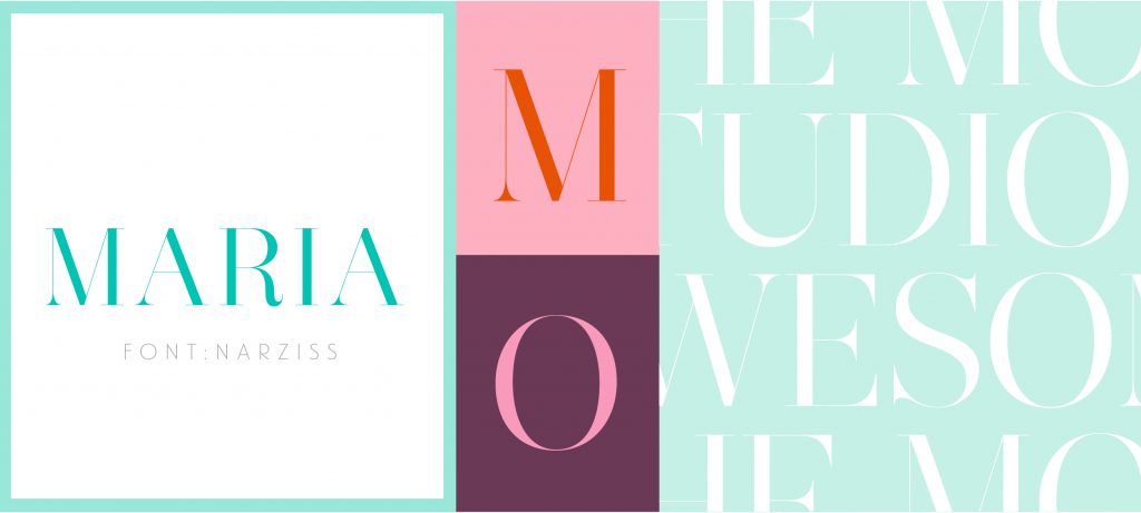
Maria: Narziss
This neo-classic serif is a perfect fit for our President and creative director Maria – it’s classy, it’s sassy and it definitely leaves a mark. It’s one of my favorite typefaces for its exaggerated curves and ultra thin connectors – great for anything luxiurous or fashion-related!
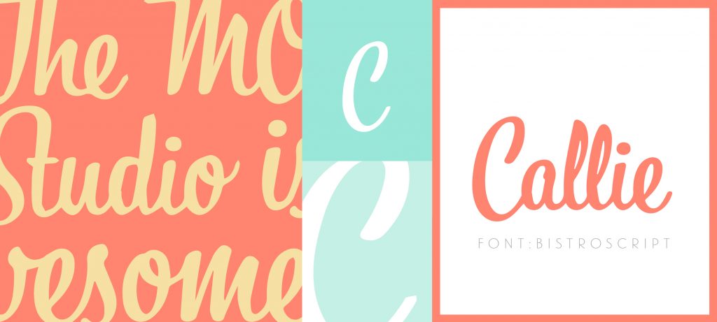
Callie: BistroScript
Like our wordsmith wonder/resident comedian, Callie, Bistro is bold, fun, and pretty easy-going. This contemporary script mimics freehand calligraphy, which gives it a handwritten feel. Bistro’s great for all fun-loving projects as a display (headline) font.
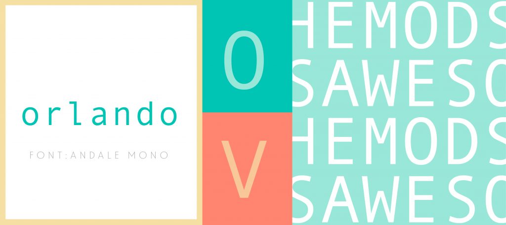
Orlando: Andale Mono
Andale Mono is the Helvetica of programming fonts as far as I’m concerned, which is why it’s a perfect match for our developer Orlando. There’s something futuristic and digital about Andale that is visually striking, unlike most coding fonts for web. Andale’s perfect for a digital-themed project without looking cheesy or contrived!
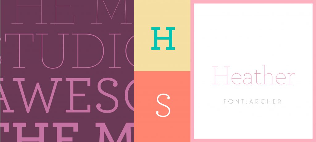
Heather: Archer Pro
Because of Archer’s clean details and visible warmth, it’s become a modern classic in the type world – and a match for our marketing coordinator, Heather. Archer’s one of those fonts that consistently works within a multitude of projects because it’s cute, modern, and to the point. It’s a great font that works well for display type (headlines) and copy (text) – versatility is key!