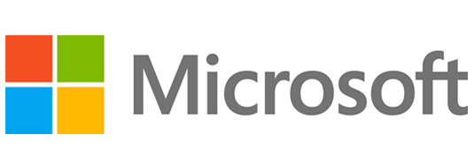
A Corporate Rebrand: 25 years in the making
By MODintelechy / Design
By now you’ve probably heard about the Microsoft rebrand. Clean, simple, we don’t have a problem with it. But surely they could have strayed from marking their corporate identity with that of the iconic Windows color blocks?
According to their blog, “The symbol is important in a world of digital motion. The symbol’s squares of color are intended to express the company’s diverse portfolio of products.”
Which would be acceptable if the squares were a newly introduced element, not a refresh of the Windows logo.
What do you think? Does the new look really convey diversity? Or does it seem a little lackluster for something 25 years in the making? Drop us a line in the comments!


