#Mood: Mood Boards as Design Tools
As designers, it can be difficult to put a particular emotion or idea into words when we think a particular shade of green or font family would do it justice. So, we make a mood board—a simple graphic tool which allows me to experiment with design elements and make my vision, reality.
Simply put, mood boards are compositions of images, materials, fabric, text (you name it) meant to evoke a specific style or idea. It’s the starting point for what will eventually become a style guide with a defined color palette, typography, layout, image treatment, etc. Mood boards allow creatives to propose a look or idea without investing too much energy in its execution. They show your audience what your intended visual direction is for a project and put everyone on the same page early on.
The MOD Studio makes mood boards to kick-off creative thinking for each of its design projects, including the recently launched Eanes ISD branding redesign. Here’s how we did it—from mood board to mockup.
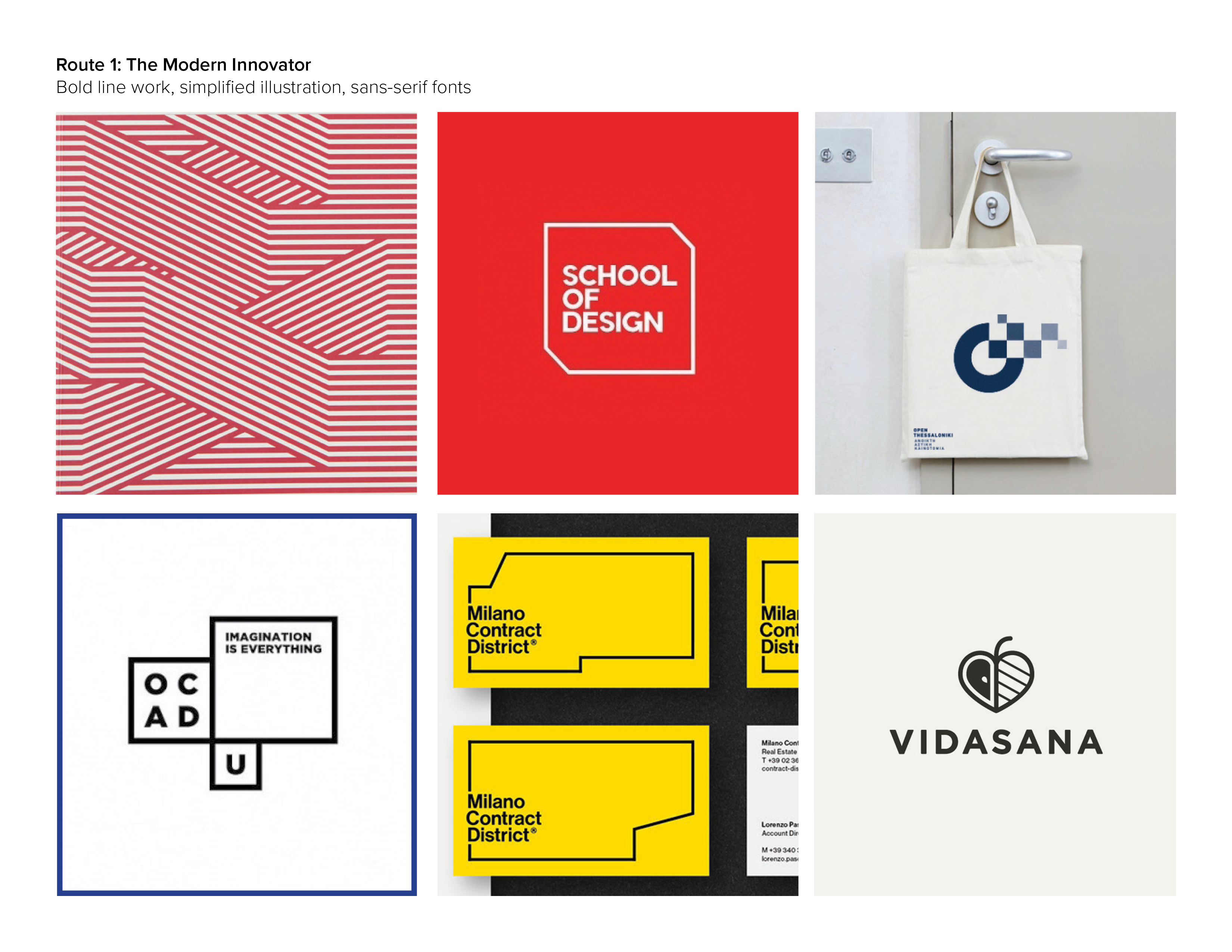
Route 1: The Modern Innovator
Eanes is the Innovative School District, so we collected images and typography that were at once modern and direct in their design to reflect Eanes’ progressive mindset and forward-thinking curriculum.
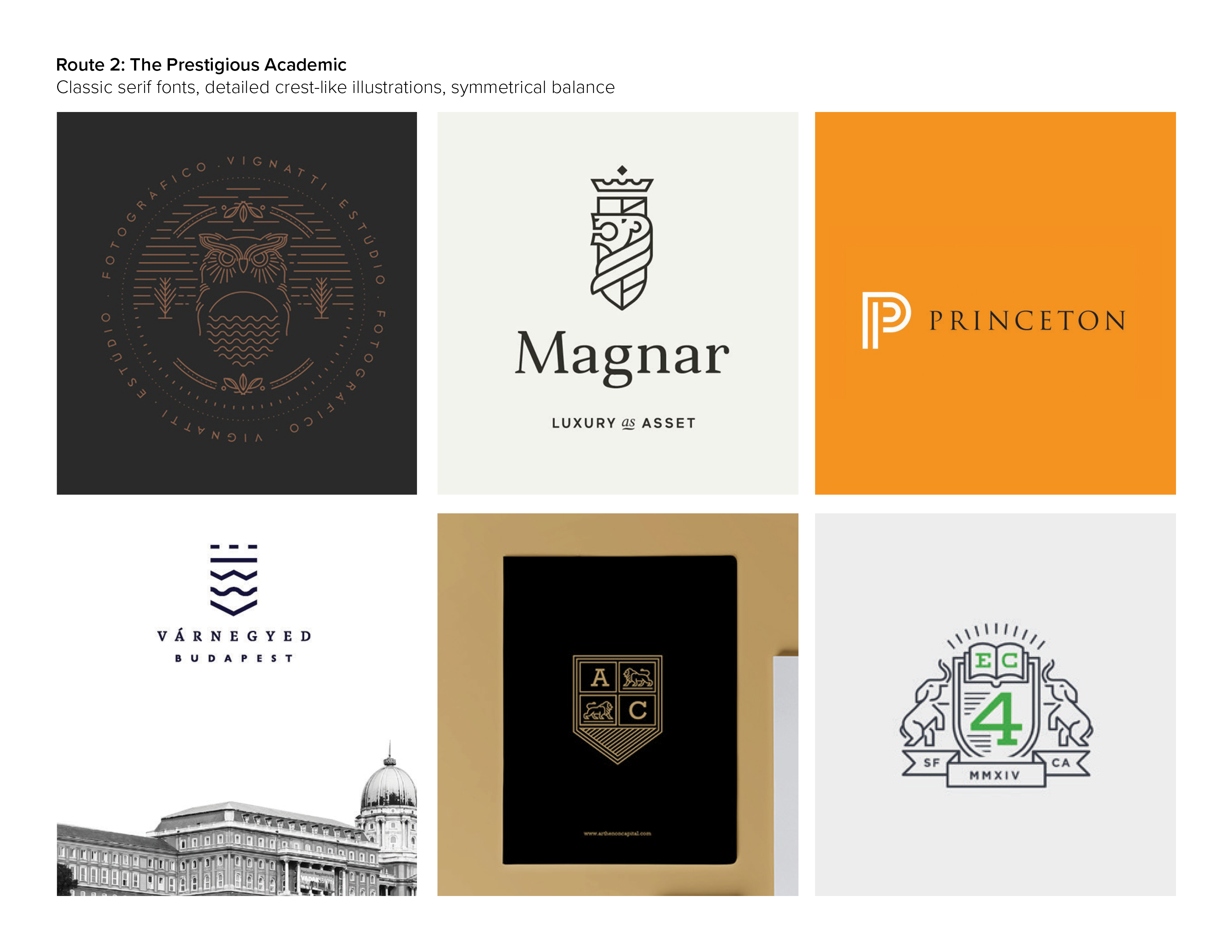
Route 2: The Prestigious Academic
We also looked to traditional heraldic symbols and serif-fonts to reinforce Eanes’ scholastic achievements and commitment to enrichment. We were particularly inspired by those with heavier graphic treatment.
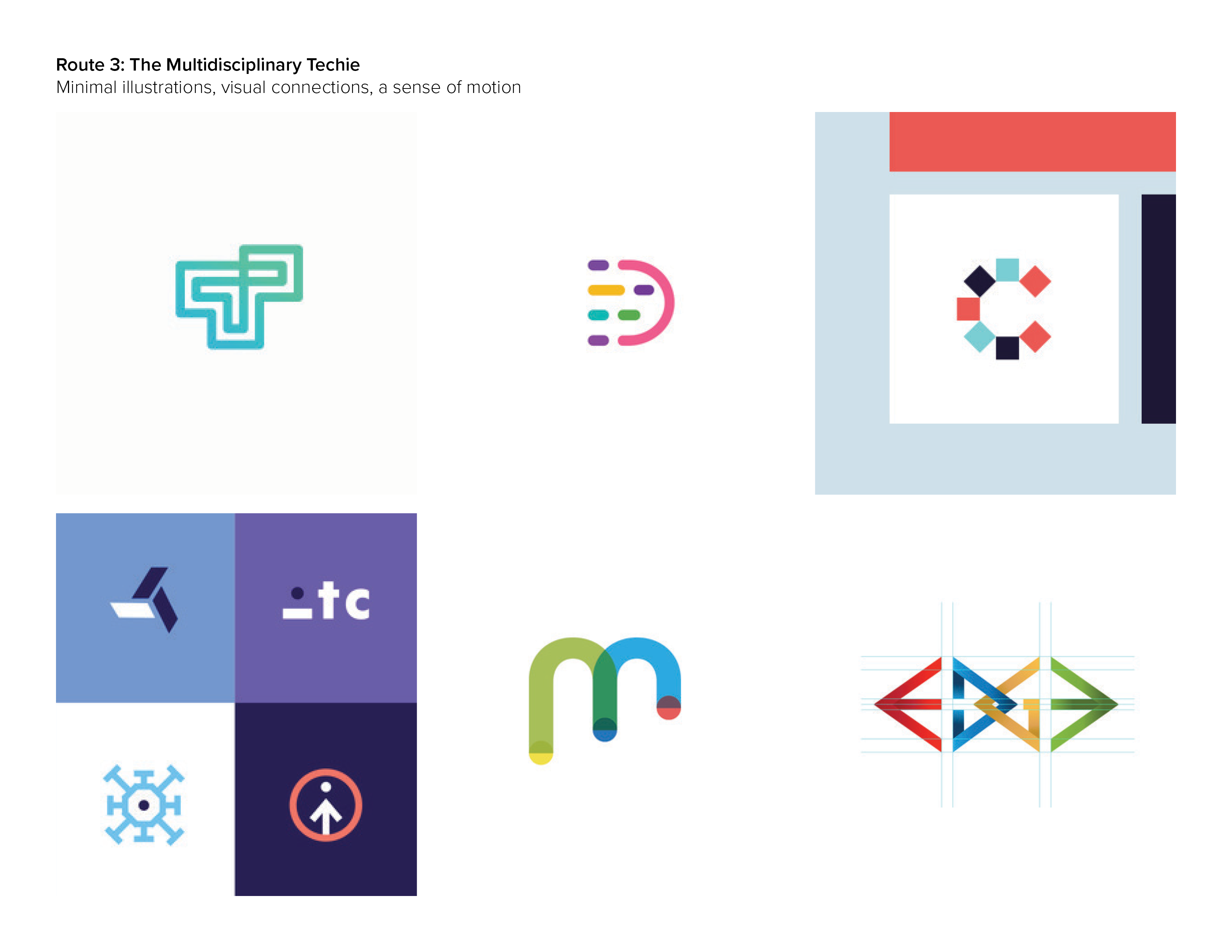
Route 3: The Multidisciplinary Techie
This grouping showcases how multiple geometric elements work to form a singular mark—much like Eanes’ multi-disciplinary approach. The selected images also speak to their constant educational advancement and incorporated technology through use of implied motion and computational symbols.
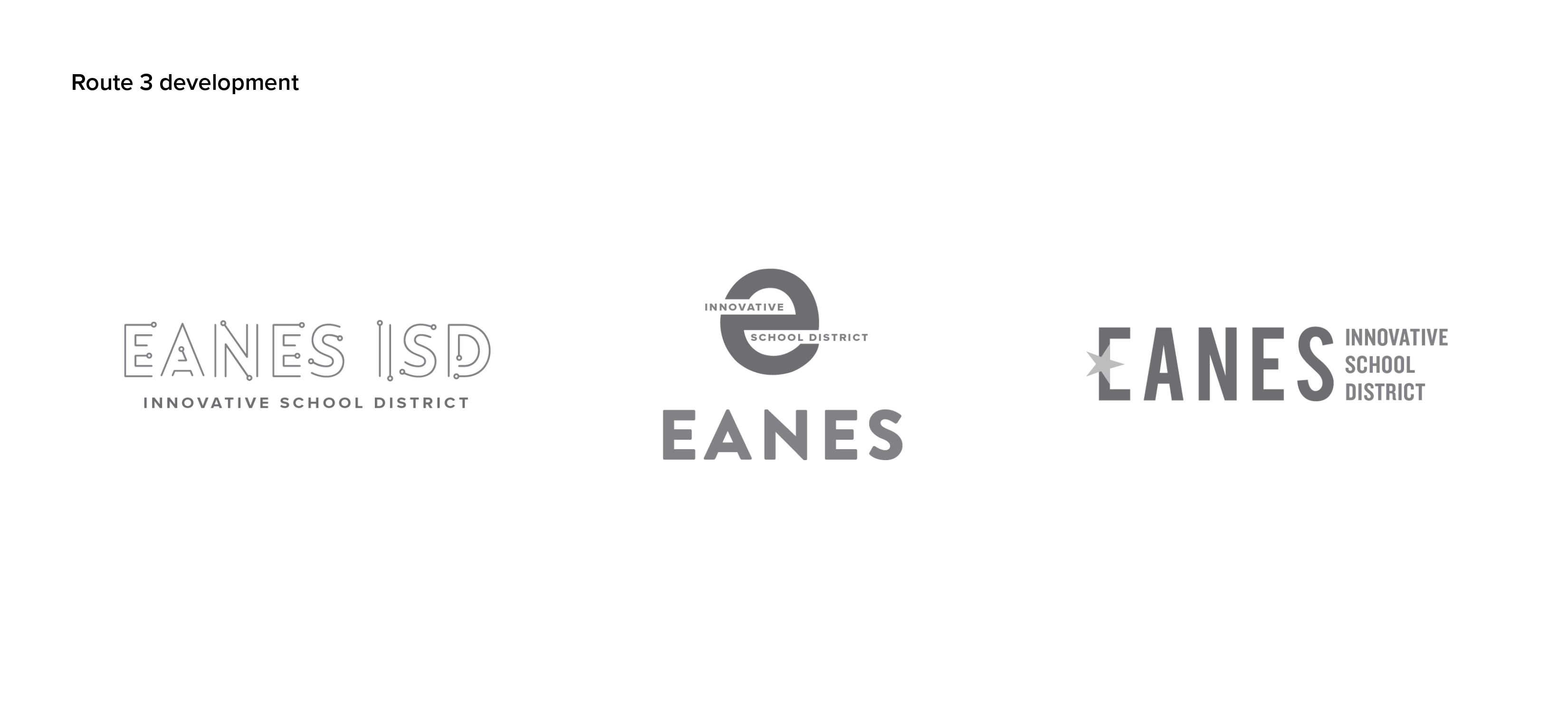
Route 3 Development
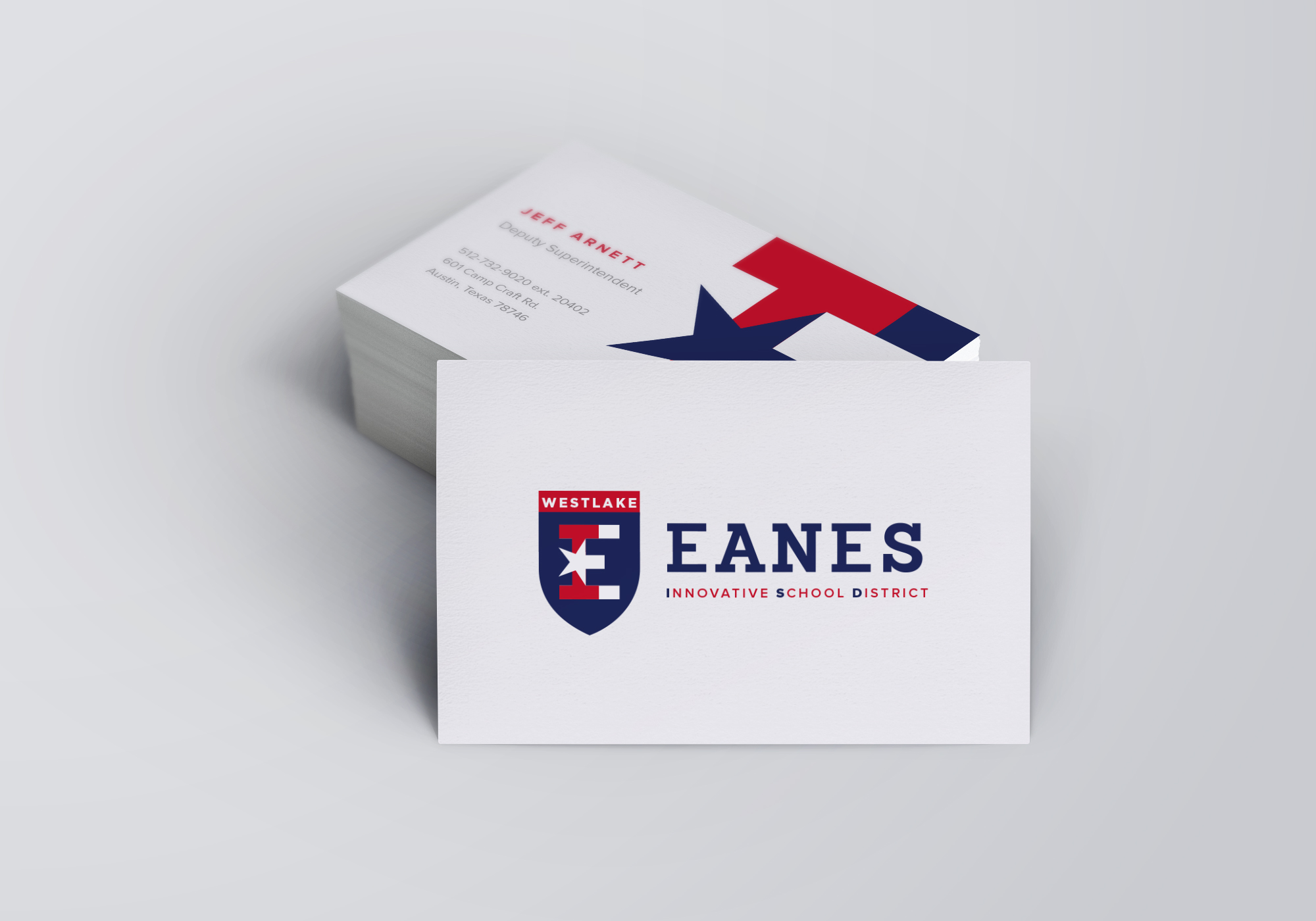
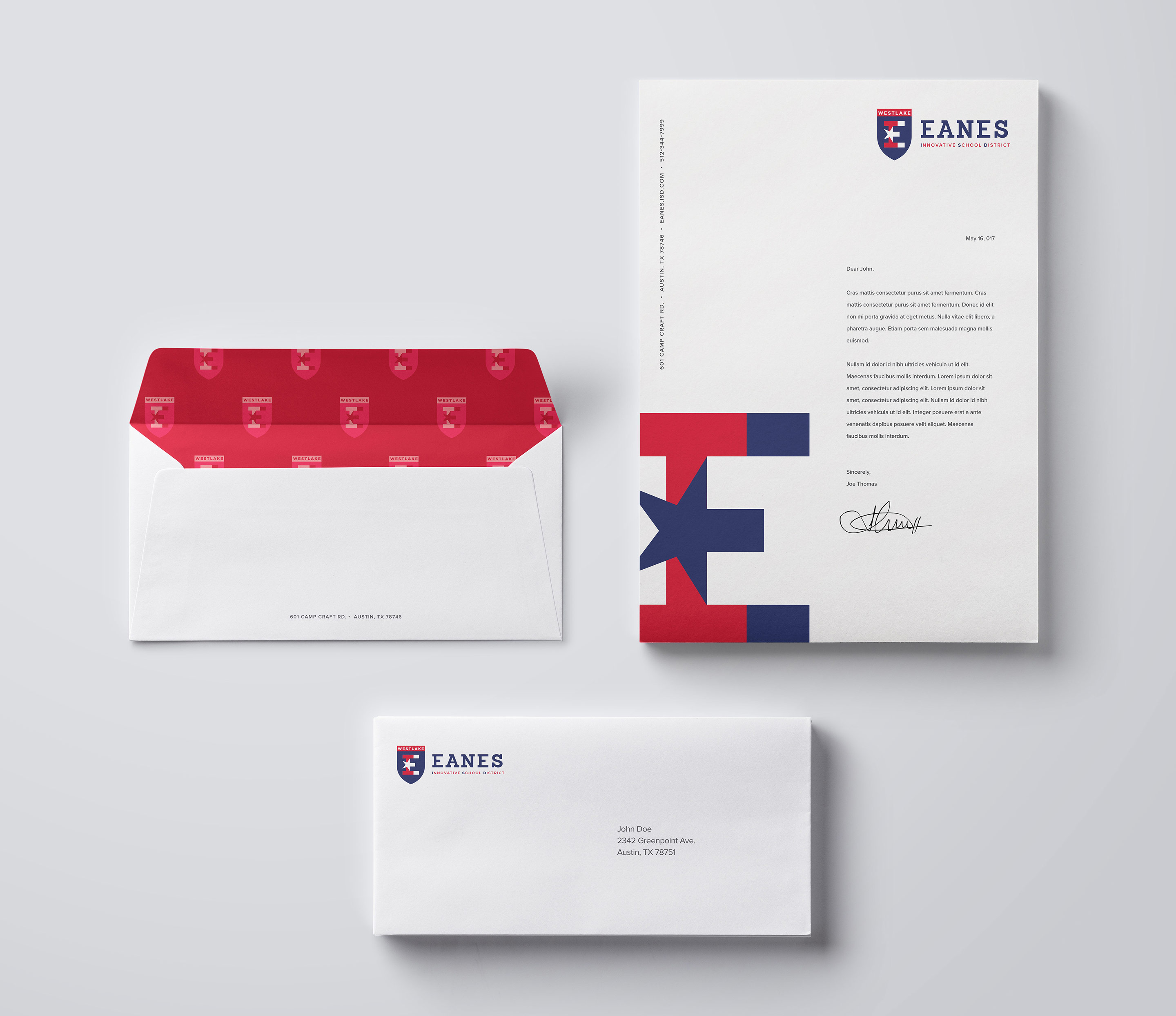
Following conversations with the client, we further developed the third route. It’s clear how the mood board helped to guide our design using a minimalist approach with clean lines, bold typography, fused elements and the subtle indication of movement.

 Back
Back  MODintelechy


